




Lead with what you learned
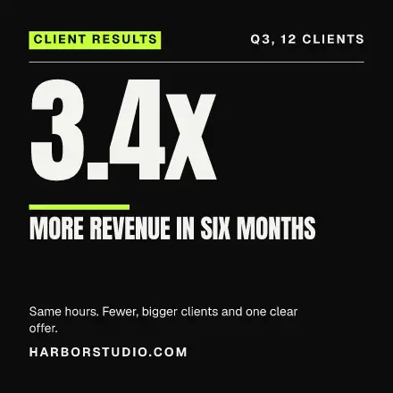
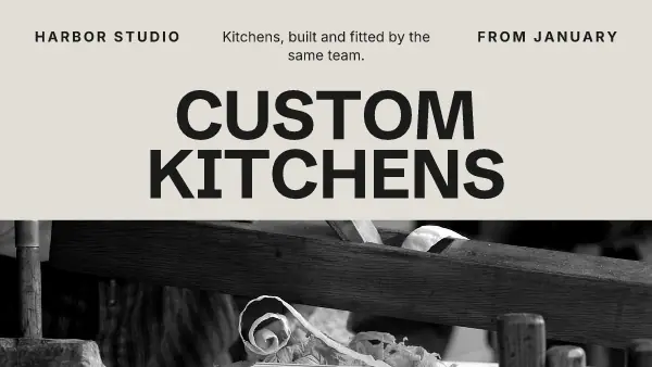
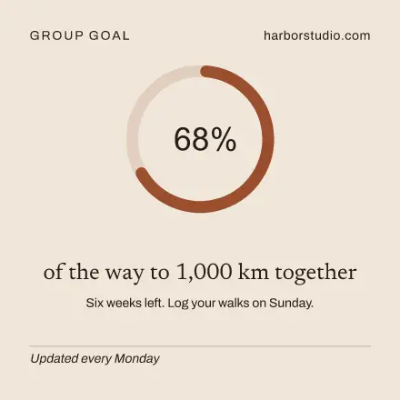
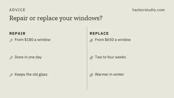
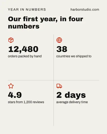
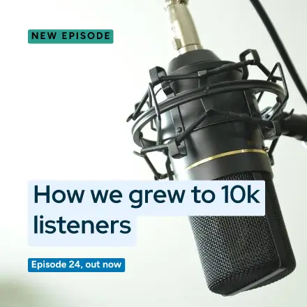
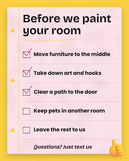
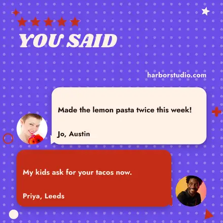
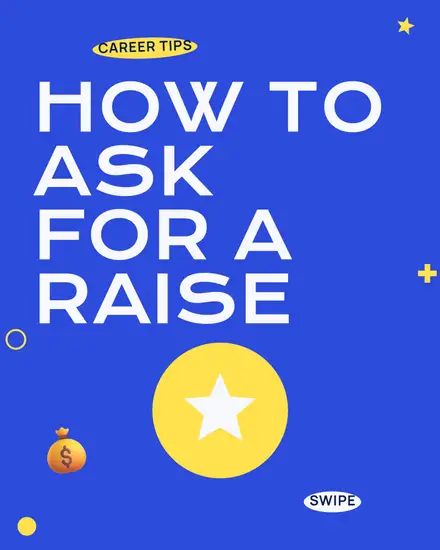
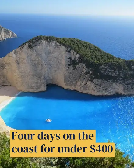
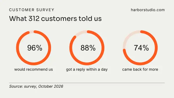
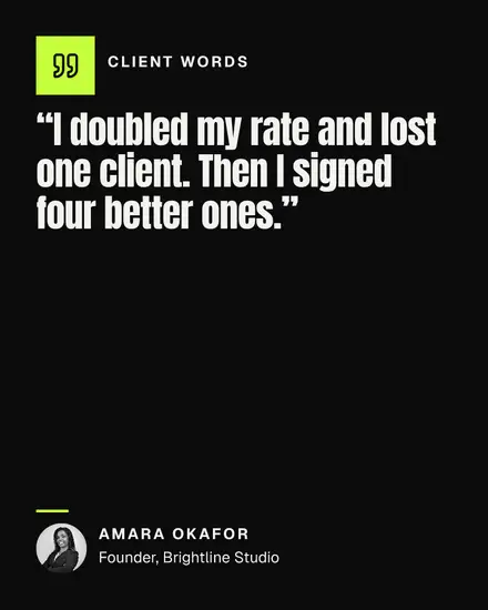
On LinkedIn people stop for something they can use or a number they did not expect. "3.4x more revenue in six months" on a picture, with the story of how in the text, works better than "We are proud to announce". Pick a template with one big number or one short line, and let the text under it carry the detail.
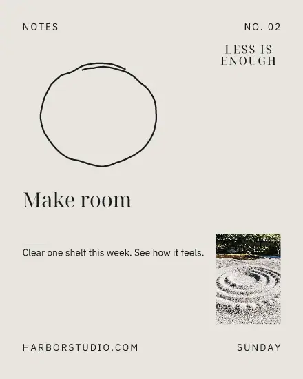
A quiet look reads better here
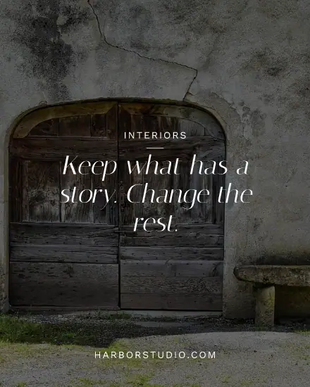
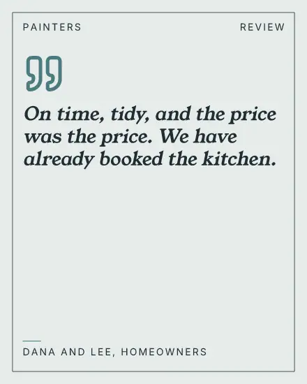
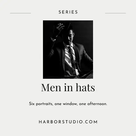
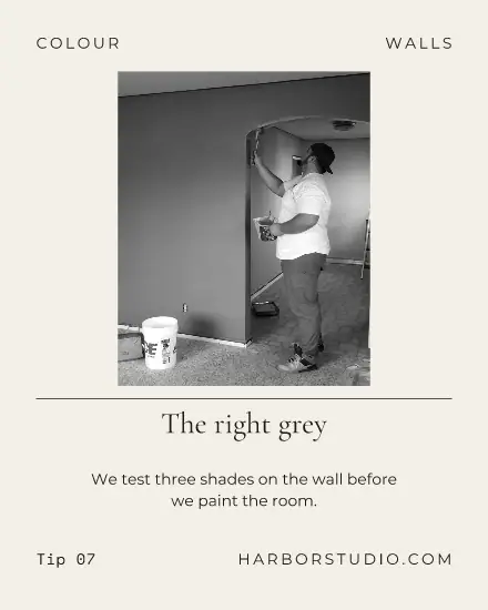
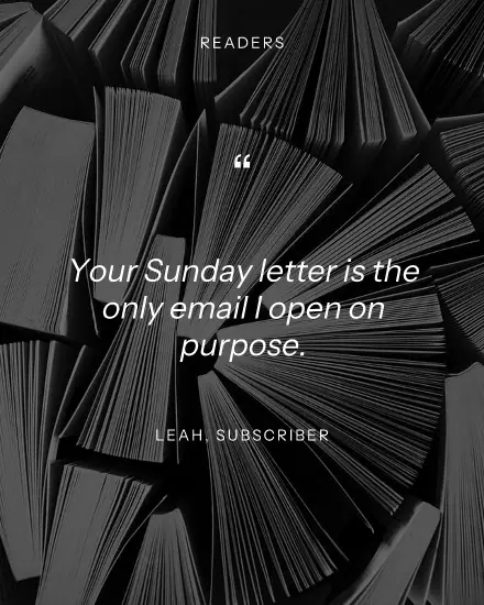
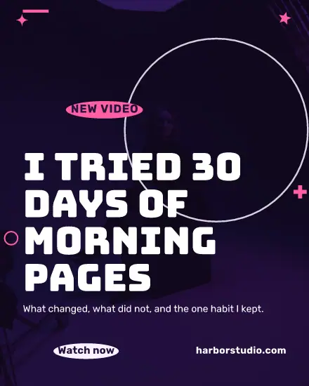
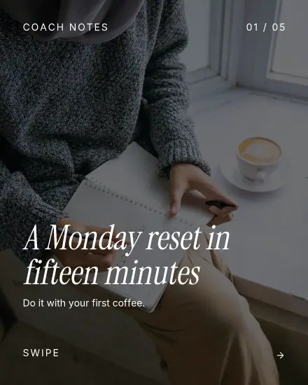
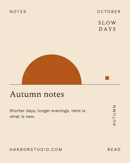
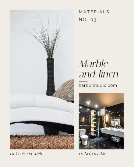
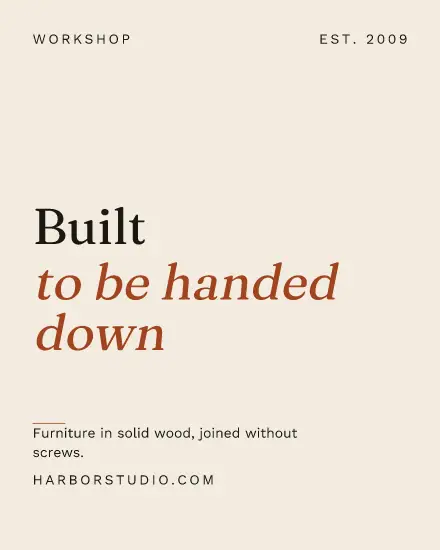
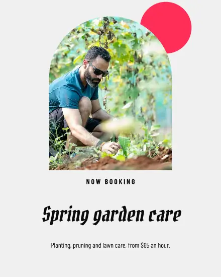
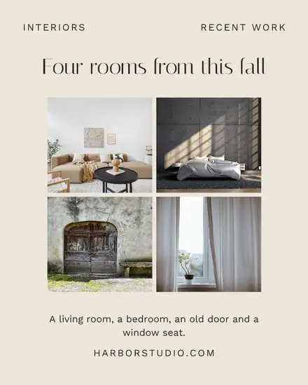
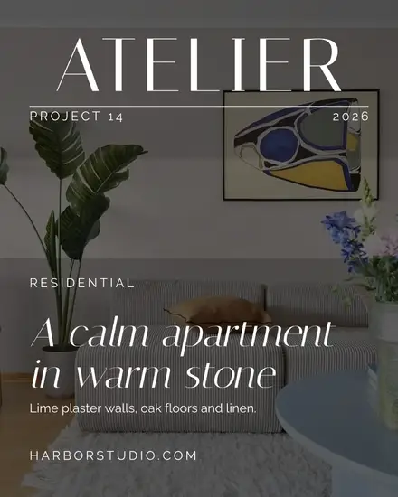
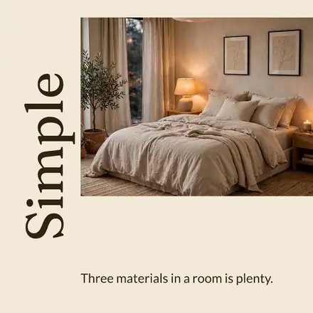
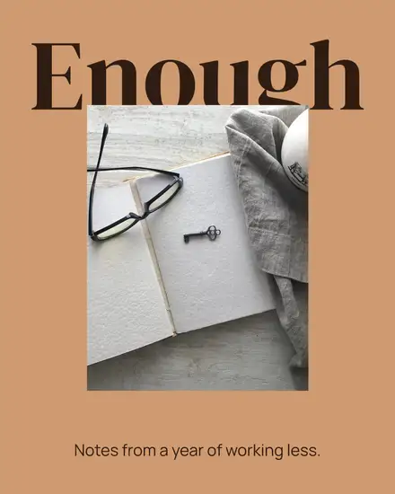
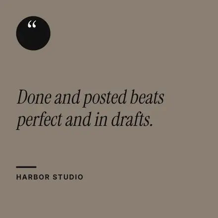
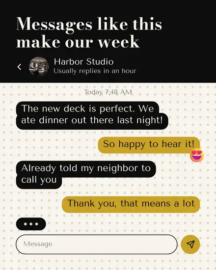
Most of the feed is grey text and faces. A plain page with strong type stands out without shouting. That is why this page leans on calm serif looks and dark pages, with the louder colors kept to a few. If your brand is loud, press Your brand and it follows along.
Write the post as yourself
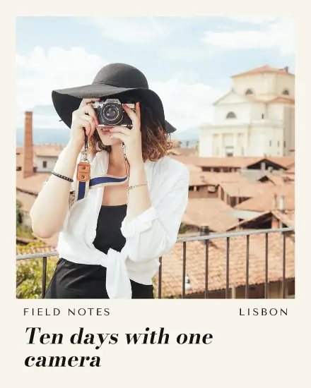
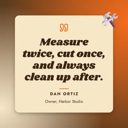
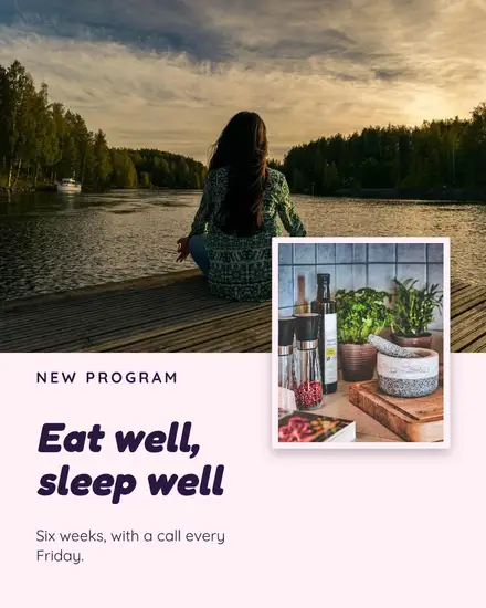
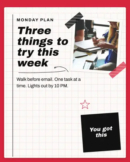
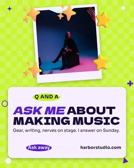
The picture stops the scroll, and the text does the rest. Write the first two lines so they make sense before the "see more" cut. Tell it in the first person, end with a real question, and keep the words on the picture short: a picture that repeats the text gives no reason to read both.
Sizes that work
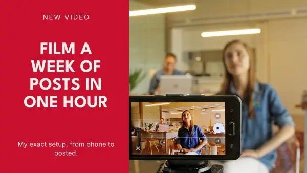
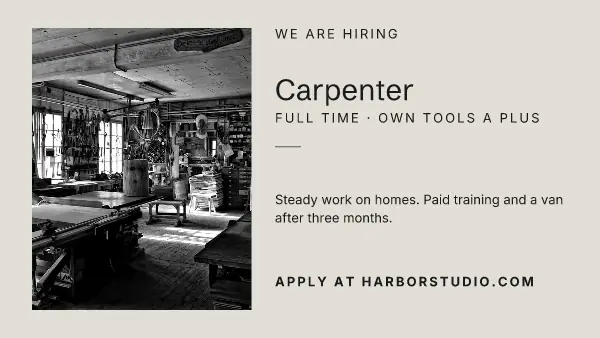
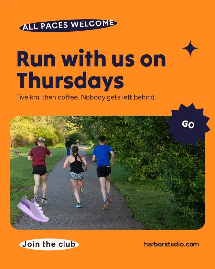
Square and 4:5 take up the most room on a phone. Wide 16:9 suits news and links on a computer. All three come from one design: tick them under Sizes.
FAQ
What size is a LinkedIn post?
LinkedIn has no single size. 1080 x 1080 for square, 1080 x 1350 for 4:5 and a wide 16:9 all show well, and these templates cover the three.
Can Postfjord post to LinkedIn?
Yes, to your LinkedIn profile. Connect it under Channels and schedule the post with its picture from the calendar.
Can I post tips as several pictures?
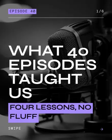
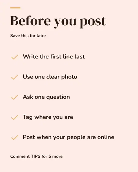
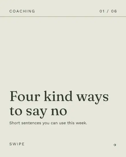
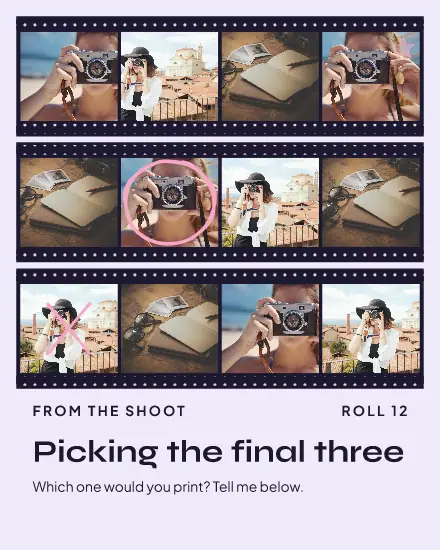
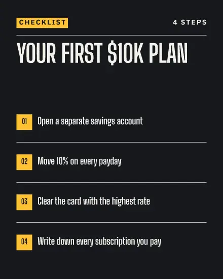
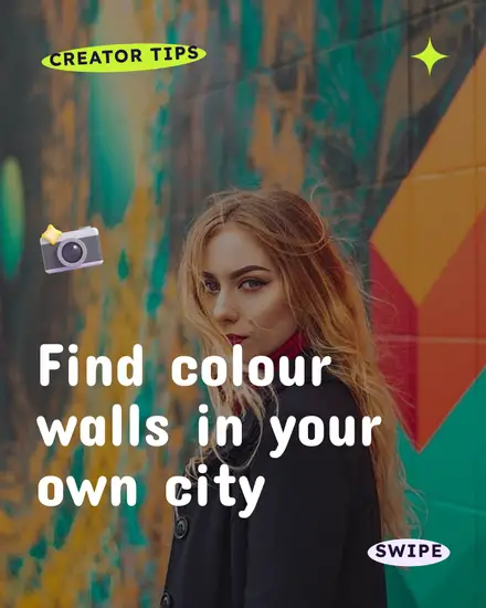
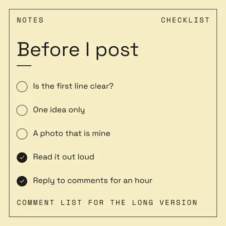
Yes. The tip carousels here are several pages in one design. Press Share, then New post with this design, and the pages go in order.