Loud on purpose
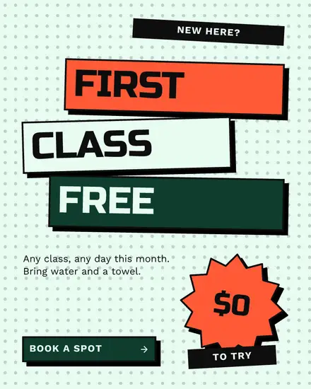
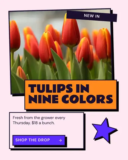
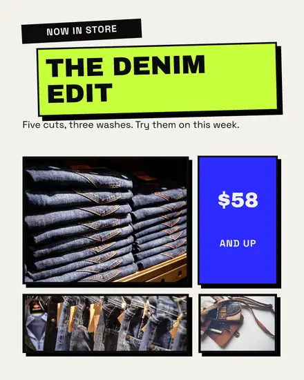
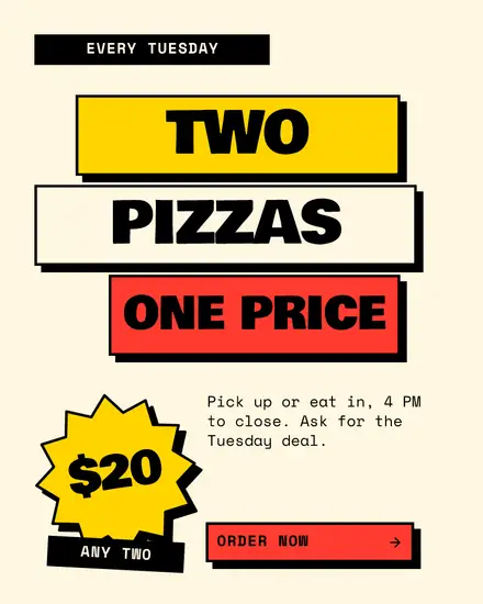
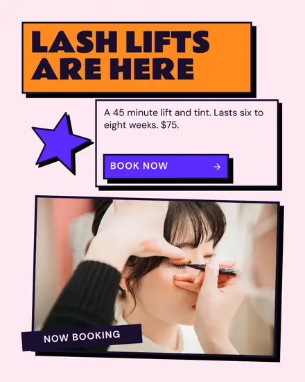
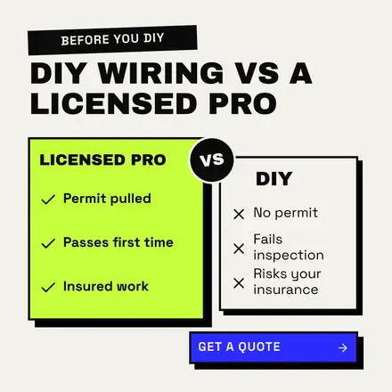
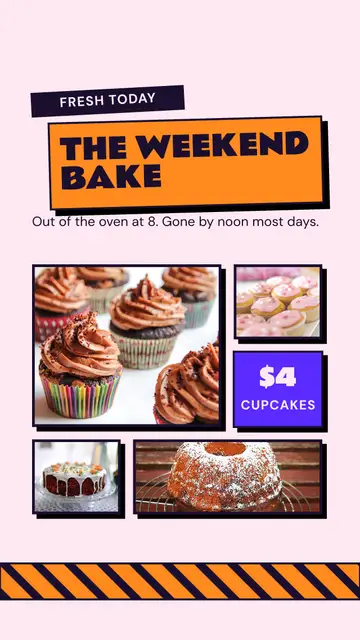
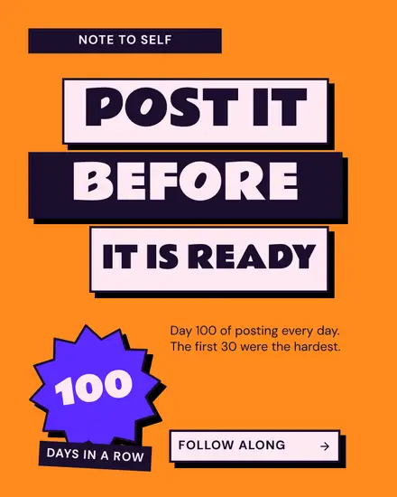
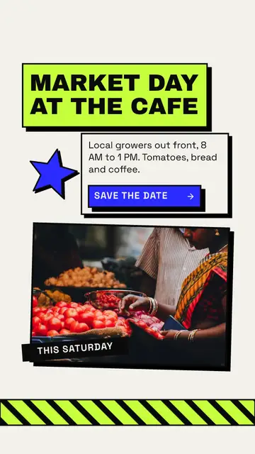
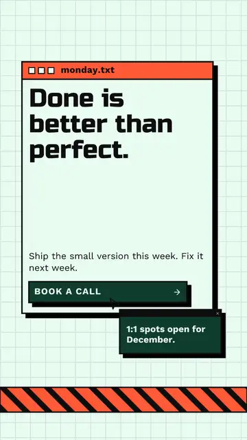
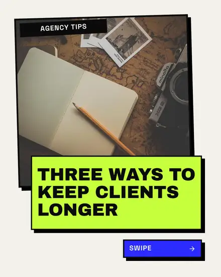
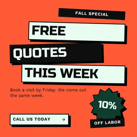
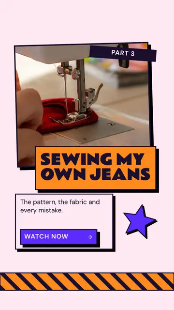
Neo-brutalism took over app and website design a few years ago, and it works on a feed for the same reason: nothing about it is soft. Every box has a thick black outline and a hard shadow offset to one side, with no blur. Colors are flat and bright. The boxes sit a little crooked, staggered or overlapping, so the page looks put together by a person in a hurry, which is the point.
The looks in it
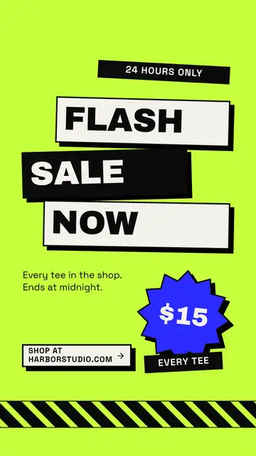
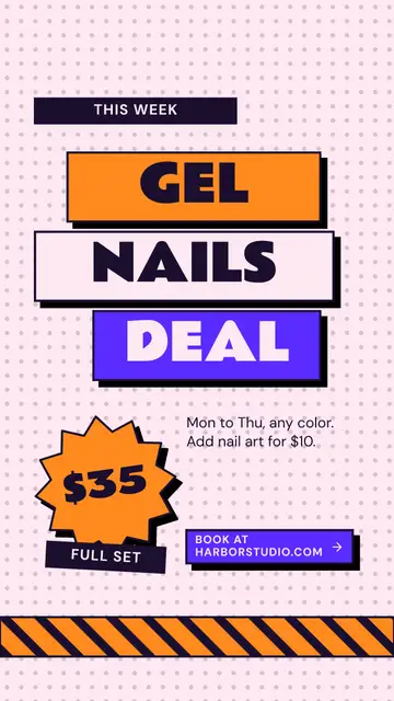
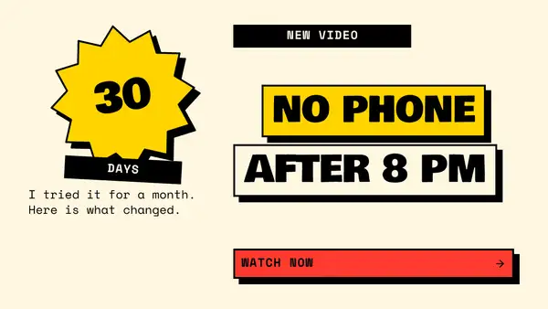
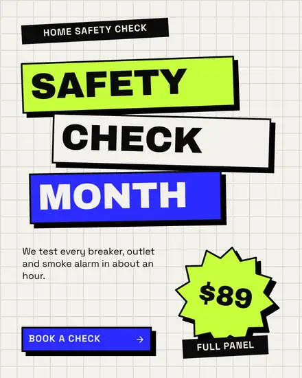
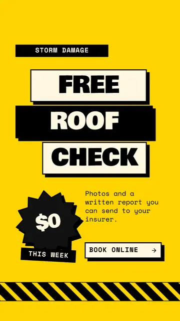
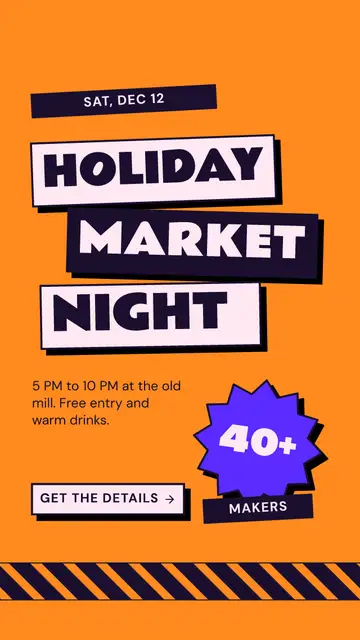
- The slab: a sale poster with the headline on two or three outlined slabs, a price on a starburst and a button
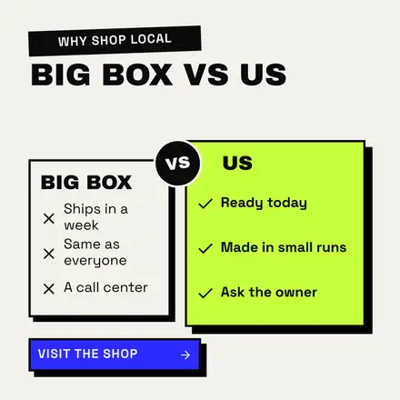
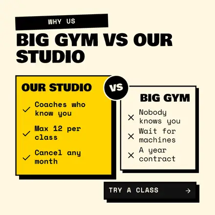
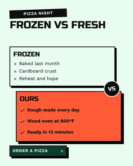
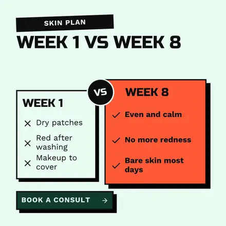
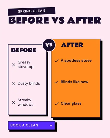
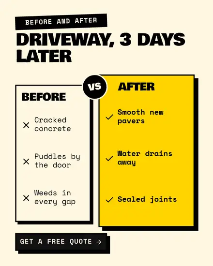
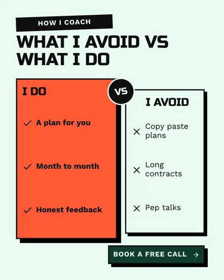
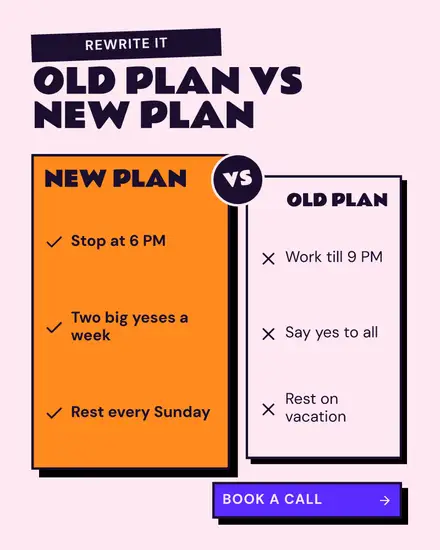
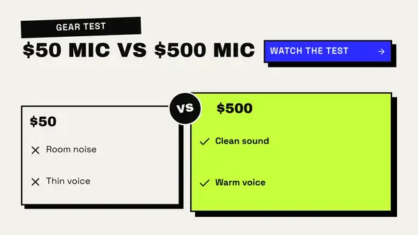
- Versus: two outlined cards of different sizes, crosses on one and ticks on the other, with a round VS badge between them
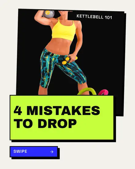
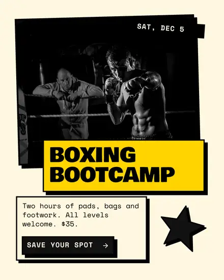
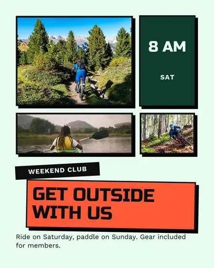
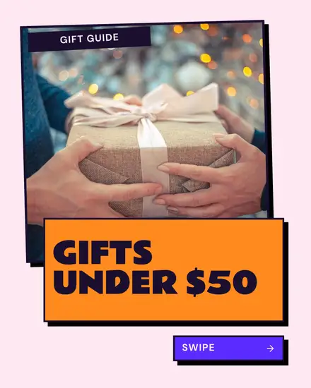
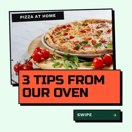
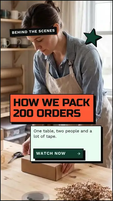
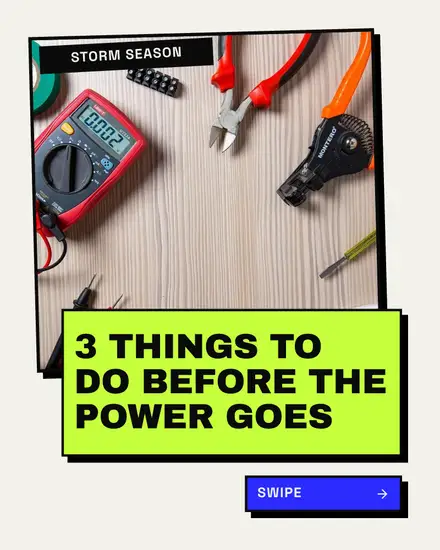
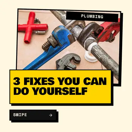
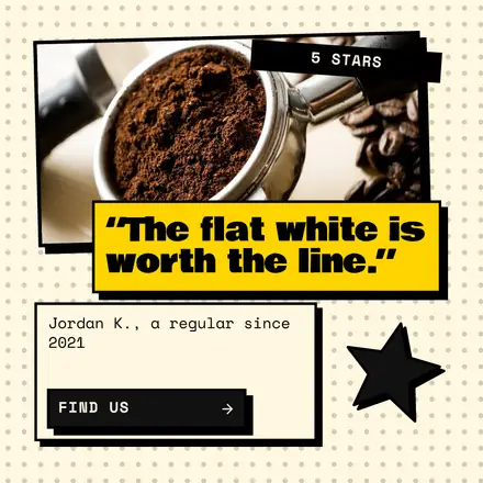
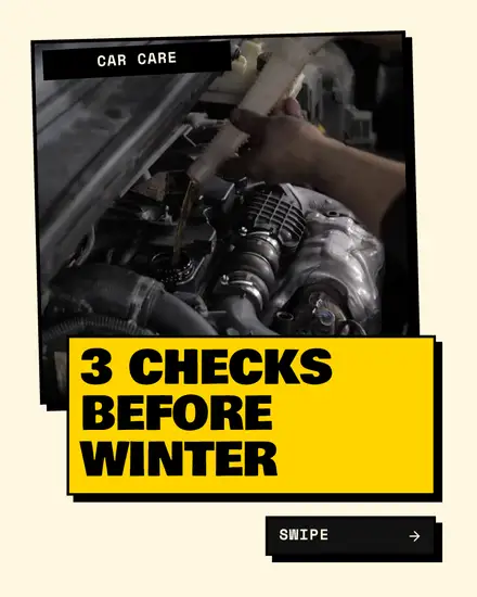
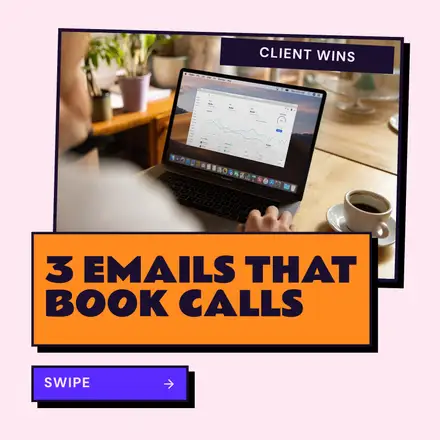
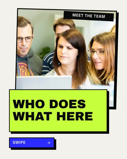
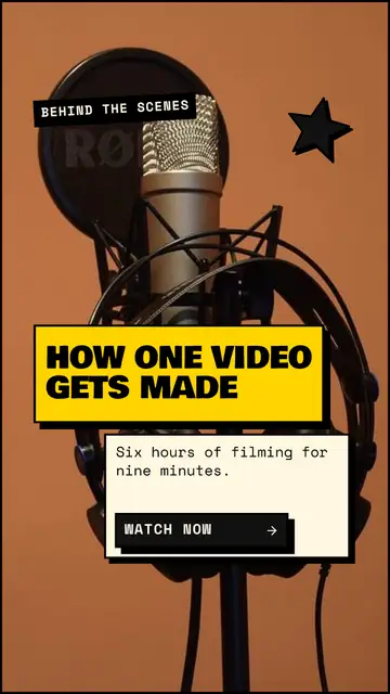
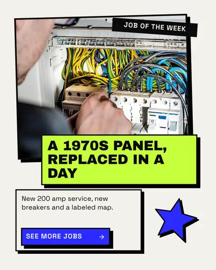
- The framed photo: a photo in a thick frame with the headline on a slab that overlaps it, and a turned sticker
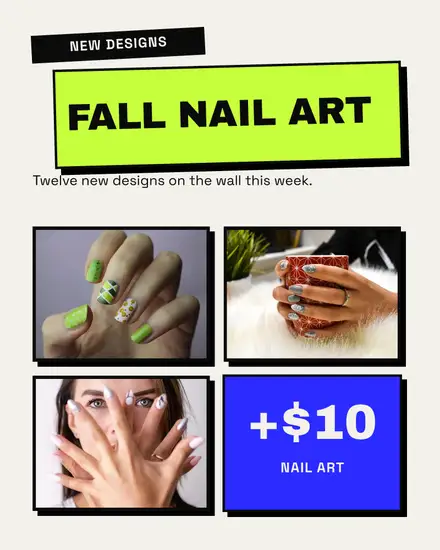
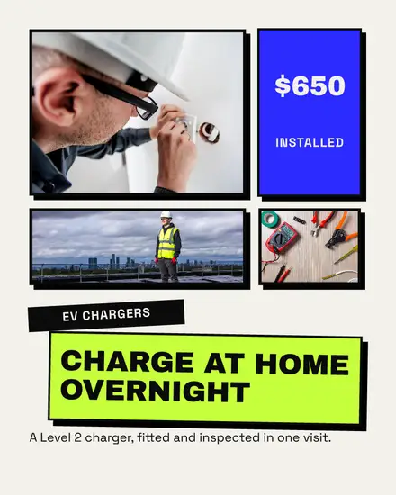
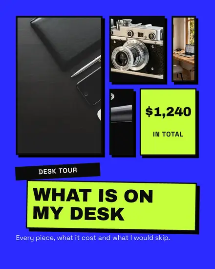
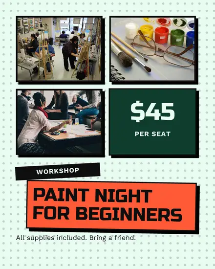
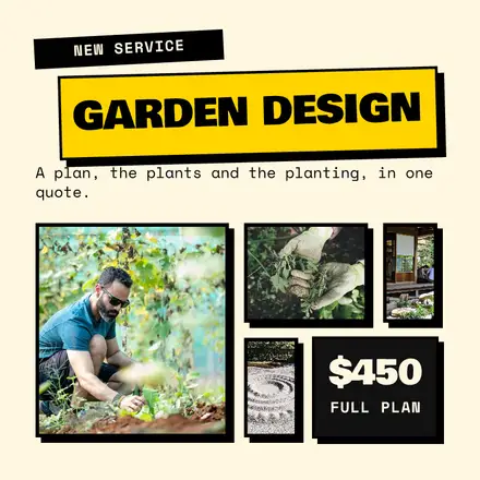
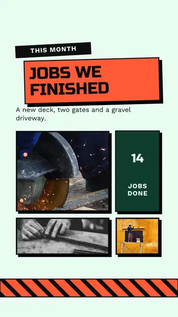
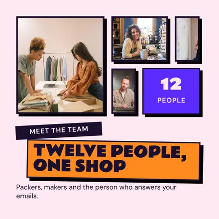
- The bento: a grid of framed photos with one flat tile holding the price
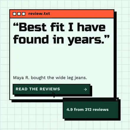
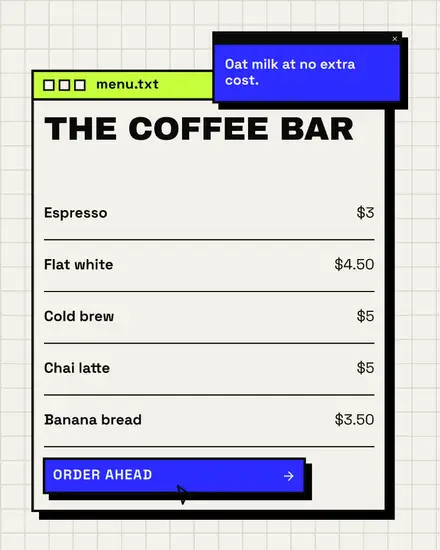
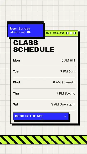
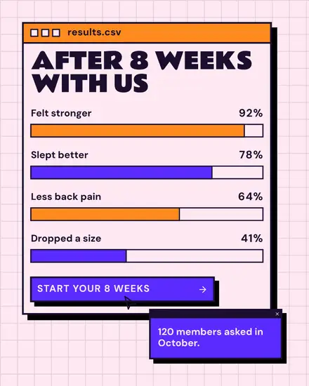
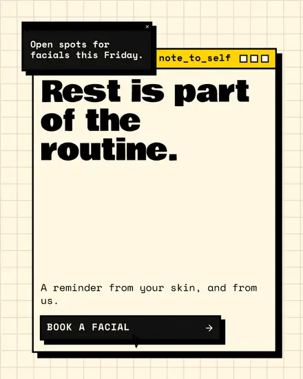
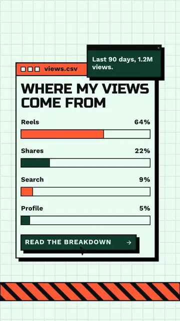
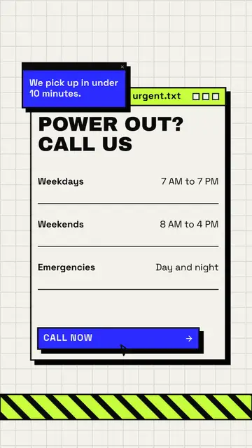
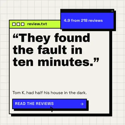
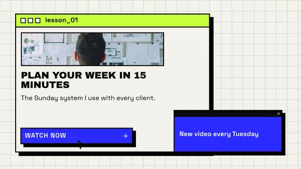
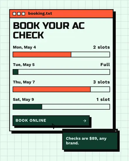
- The app window: a chunky window with three squares in the title bar, a list, value bars or a photo inside, and a small pop-up over its corner
- The deck: a carousel with a big number on an outlined square for each tip
Who it suits
A shop with a flash sale, a gym launching a bootcamp, a coffee bar posting its menu in a window, an electrician with emergency hours, a creator comparing cheap and pricey gear. Software teams use the app window for a changelog, open roles or pricing. The versus look is good for one honest comparison: the big box store against you, the old way against the new one.
Keep it readable
The style is loud, so the words have to be few. One slab, one line. If the post needs a paragraph, put it in the caption. Leave the hard shadows alone: moving or blurring them is what makes this style look like any other.
Your colors
The outlines and shadows stay black. Your colors fill the boxes: the page can be your light color, your main color or your accent. Press Colors and then Your brand to use them, then Shuffle to try another layout. In a story, the empty band under the app's buttons gets a strip of caution tape instead of blank space.
FAQ
Is neo-brutalism the same as brutalism?
No. Brutalist web design is raw and plain, often with default fonts. Neo-brutalism keeps the bluntness but adds bright colors, a friendly font and the hard shadow.
Can I use it on LinkedIn?
Yes. The app window and versus looks read well on LinkedIn, and there are square and wide sizes for it.
Does it work for Black Friday?
Yes. The slab poster was drawn for sales like that. You find the Black Friday ones on their own page with the rest of the weekend's templates.